Interactive Arctic Stakeholder Mapping application launched as part of the KEPLER (Key Environmental monitoring for Polar Latitudes and European Readiness) H2020 EU Project.
KEPLER (Key Environmental monitoring for Polar Latitudes and European Readiness) is a multi-partner project running over eighteen months funded by the EU’s Horizon 2020 programme. One of KEPLER’s key aims is to facilitate the work of Copernicus, the European system for monitoring the Earth, by considering the needs of end-users and stakeholders. This is essential for ensuring that Copernicus evolves into a monitoring programme that is relevant and delivers the necessary information to tackle the issues facing European actors in the Polar Regions. The Arctic Stakeholder Map application plays a part in that goal.
Blue Lobster were commissioned by the British Antarctic Survey (BAS) on behalf of the consortium of the EU Horizon 2020 KEPLER project, to design and build an Arctic Stakeholder Map application. The application allows users to explore and obtain information relating to a variety of stakeholders in the Arctic region.
The Arctic Stakeholder Map is an exploratory application, giving users the option to view information on various Arctic region stakeholders in a predominantly map-based application. Stakeholder data points are shown in geographical context, whereupon, if a user clicks a point, the information associated with that data point can be viewed, with links out to further resources and external content.
The technical approach to this development included creating a database for storing the stakeholder interests as well as other administrative data. An API was created to enable the front end of the application to communicate intelligently with the MongoDB NoSQL database used for the data storage. The API was developed using Node.js. The front end was developed using React.js and a variety of components to enhance the features and overall UX (User Experience). The web-GIS mapping functionality leveraged Leaflet, with custom vector and raster layers and a bespoke implementation of GetCapabilities and GetFeature requests to interact with WMS services. The administration area allows new geographical data points to be added or amended easily and the entire application was designed to be portable to future projects/applications or embedded into other websites. A significant advantage of the approach taken is that there is an increasing number of applications being built in this sphere at the moment and by creating an API in this way, it will allow bilateral machine to machine communication, therefore enhancing the system-of systems approach.
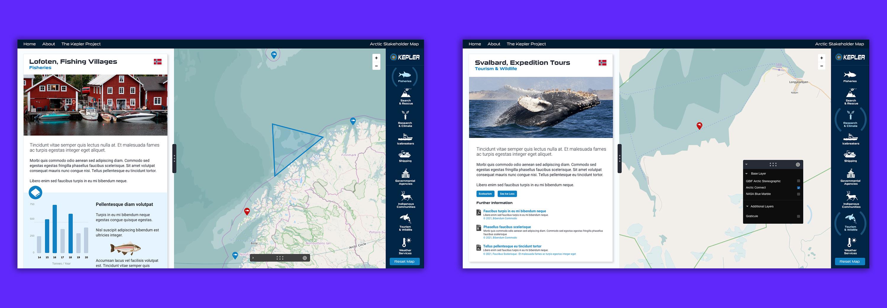
The Home page has both an introduction to the map, the map itself and pictorial icons in a sidebar to enable users to choose the view most suited to them. Different data points are displayed for different users, including, fisheries, search & rescue, research & climate, icebreakers, shipping, governmental agencies, indigenous communities, tourism & wildlife and weather forecasting. There are also three different base map options available and a reset button to return to the main map view. To the left of the map, in a panel, is the data detail view. The panel can be resized and is scrollable. On mobile devices, the sidebar is replaced with a scrollable bottom menu (based on the principle of thumb driven design) and the detail panel is moved to the top with a prompt to view the detail of map points.
For the administrators of the services, there is specific functionality where new content may be added and maintained. The starting point for administrators is a dashboard, which provides quick starts for adding new items, inviting users to administer the system, or importing data. To reduce data errors, imported data is quarantined to enable validation of the data before publishing.